
Nobody complains about the whole day. They complain about nine o'clock. Across shop after shop we see the same pattern: the monthly report says the server is healthy, the daily average has not moved, and yet the morning rush feels heavier than it did last month. So which hour of the day is slower, and since when?
Which hour of the day is slower than it used to be in SQL Server? To find which hour of the day is slower than it used to be, group Query Store history by hour of the clock and keep the days inside each hour in order. Then compare each hour's level and its slope. A busy hour that is steady matters less than a modest hour growing every morning.
That question sounds easy and almost never is. Database Health Monitor answers it with a report called Hourly Drift, and the reason it needs its own report says a lot about how most performance charts are built. First, the problem.
Hourly Drift is one of the reports in Database Health Monitor. It runs against your own servers, and it takes about a minute to have this same screen open on one of them.
In this post
- The average that hides the morning
- Why the usual charts miss it
- Which hour of the day is slower: level and slope
- What the Hourly Drift report puts on screen
- When an hour counts as growing
- Two kinds of growth, two kinds of work
- Traps the report already steps around
- What to do with the answer
The average that hides the morning
Here is how it usually goes. Someone in the business says the application is sluggish first thing. A DBA opens a monitoring tool and looks at CPU for the last week, or the last month. The line wanders along at a respectable height. Nothing is red. The ticket gets closed with a note that the server has plenty of headroom.
And the note is true. Across the day, the server does have headroom. But a server is not judged across the day. It is judged at its worst hour, by whoever happens to be sitting in front of it at that moment. If nine o'clock is the hour that runs out of room first, the other twenty three hours are irrelevant to the person waiting.
What makes this hard is that two things can be happening at once. Mornings may be growing steadily while the overnight batch shrinks, perhaps because someone finally tuned it. One goes up, the other goes down, and the daily total looks like a calm plateau. Two real movements, reported as nothing.
Why the usual charts miss it
There are two charts people reach for, and each one throws away half of the answer.
- The heatmap by hour. It shades each hour of the day by what it cost. To do that it has to average every occurrence of that hour into a single cell. A nine o'clock hour that has doubled over two weeks gets painted exactly like one that never moved. The history is gone before you see it.
- The trend for the whole database. It fits one line through everything. That line cannot tell the difference between a quiet month and a month in which one part of the day got worse and another got better by the same amount.
The heatmap keeps the hours and loses the days. The trend keeps the days and loses the hours. You need both at the same time, and that is a different shape of chart.
There is also a cost to getting this wrong that does not show up on any dashboard. Hardware gets bought for a problem that lives in a single hour. A tuning project gets pointed at the busiest queries of the whole day when the trouble is one particular slot. And the real cause, a job that moved, a new process that starts at the top of the hour, a report that now runs on Monday mornings, goes unfound for another quarter.
Which hour of the day is slower: level and slope
The honest way to answer is to give every hour of the day two numbers instead of one. The first is its level: how heavy that hour typically is. The second is its slope: whether that same hour is getting heavier or lighter as the days go by.
The pair is the finding. An hour can be the busiest of the whole day and perfectly steady. That one is simply where your load lives, and it can be left alone. Another hour can look modest and be growing four percent every morning. That one is the surprise, and it is the one that will be your busiest hour in a few months.
To get there, the hours in a window are sorted into the 24 slots of the clock. Inside each slot the days stay in order, oldest first. That is a cycle plot, and it is the old trick of folding a long series over itself so that the repeating part and the changing part can both be seen. Query Store is the right raw material, because it already records executions, CPU, duration, reads and log bytes in fixed intervals. The data lives in sys.query_store_runtime_stats, and each row is placed in its hour through sys.query_store_runtime_stats_interval.
What the Hourly Drift report puts on screen
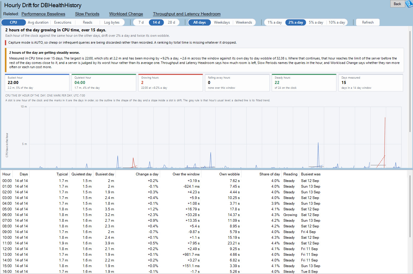
You find it in the tree under a database, at Real Time, Query Store, Hourly Drift. At the top, a one line verdict names the hour that is moving the most. If nothing is drifting, it says so and tells you where the quiet hour is, which is useful in itself.
Under the verdict sit six tiles. Busiest hour (or Slowest hour, when you measure average duration) and Quietest hour give you the shape of the day. Growing hours, Falling away hours and Steady hours sort the day into three piles, and you can click any of them to filter the rest of the page. Days measured tells you how much history the fit ran over, and it turns amber below eight.

The chart is where the report earns its keep. Across the bottom are the 24 hours. Inside each slot is one mark per day, oldest on the left. The gray rule is that hour's usual level, so read across the slots and the rules trace the shape of your day. The dashed line is the fitted trend. A slope inside a slot is drift.
Color is the verdict. Red is growing, green is falling away, blue is steady. Teal means nothing ever runs in that hour, and gray means there are too few days to say. Every slot shares one vertical scale that starts at zero, because the hours are being compared with each other as amounts. Slots are never joined to their neighbors, which stops the eye inventing a trend that runs from eleven at night into midnight.
Hover over a slot and you get its typical reading, the reading on the day under the pointer, and what the hour did. Double click it for every day's reading. If you want the full reference for every control, the Hourly Drift documentation has it.
When an hour counts as growing
A report that cries wolf is worse than none, so an hour has to clear three bars before it is called growing. All three must hold.
- It moves fast enough. The fitted slope has to reach the percentage you set on the toolbar, one, two, five or ten percent of the hour's level per day.
- It moves far enough. Over the whole window the change has to reach a floor: one second of CPU, one millisecond of average duration, 1,000 pages of reads, ten executions or one megabyte of log. An hour that doubles from four hundred microseconds is still only four hundred microseconds, and nobody should lose sleep over it.
- It moves more than it wobbles. The fitted change has to be at least twice the hour's own day to day noise.
That third test is worth a moment. The noise is measured as the average difference between consecutive days, divided by 1.128, and not as a standard deviation. The reason is subtle and a little unfair. A standard deviation taken over a series that is drifting counts the drift itself as noise, and then concludes that the drift is normal. Using consecutive differences avoids the trap.
An hour also needs at least four days of readings before any line is fitted through it. Fewer than that and the report says so, instead of drawing a confident line through three dots.
Two kinds of growth, two kinds of work
The measure you choose on the toolbar decides what a growing hour means, and this is where many investigations go wrong. The same red slot can point at two entirely different jobs.
| Measure | What a growing hour means | Kind of work |
|---|---|---|
| CPU, Executions, Reads, Log bytes | More work is being done at that time of day, so the hour reaches the limit of the server before the rest of the day does | Capacity |
| Avg duration | The same statements take longer at that hour than they used to, because something else is running beside them | Contention |
Queries do not slow themselves down. If average duration climbs at ten o'clock while executions stay level, something is competing with them: a job, a blocking chain, a process that moved into the same hour. That is a hunt for the neighbor, not a purchase order.
The report points the way. Right click a row and you can go to Slow Periods, which starts from a slow hour and names the queries in it. For average duration there is Load Sensitivity, which finds the queries that slow down when the database is busy. For the totals there is Workload Change, which tells you whether queries ran more often or each run cost more. We wrote about the same habit of reading direction rather than totals in Is This Index Still Used? Read the Trend, Not the Total, and the principle carries straight across.

Traps the report already steps around
Hour of day analysis fails quietly when it is built carelessly, and we have seen homemade versions of it mislead people for months. A few details are worth knowing, partly so you can trust the page and partly so you can check any script of your own.
- Hours are counted from a fixed midnight. Count them from the start of the window instead and every interval whose minute falls below the window's start lands an hour late. The overnight batch ends up filed under the hour after it ran.
- Intervals are keyed on their start, not their end. An hour long interval covering 04:00 to 05:00 ends at 05:00, and keying on the end would hand its work to the wrong slot.
- Only whole hours are counted. A half hour at either end of the window would read as an hour that cost nothing, and a fitted line through it reports growth that never happened.
- Only regular executions are measured. A burst of client timeouts at one hour would otherwise look like that hour slowing down. Aborted and failed executions are tallied in the footer instead.
- Totals are weighted by executions. They are never averages of averages.
Hours also follow the clock of the computer running the report, and the footer says which offset was used. That matters when your users and your server live in different time zones.
What to do with the answer
Start by checking whether the page can run at all. It needs SQL Server 2016 or newer, Query Store switched on for the database, and an interval length of 60 minutes or less. A store that aggregates every 1440 minutes cannot be placed in an hour of the day, and the page will say so. Log bytes needs SQL Server 2017, and on 2016 the page shows CPU time instead and tells you.
Then give it enough history. Four whole days is the bare minimum for a slope, and more is better, because a single enormous spike near either end of the window can pull a fitted line around. The chart draws the marks, not just the slope, so you can see when that has happened. If the page warns that weekdays and weekends sit 3.2 times apart, set the day filter to Weekdays and read it again. An office workload's weekends are a different database, and a fit across both is decided by where the weekends happen to fall.
Read the red slots first, and ask the two questions in order. Is this capacity or contention? Then which queries live in that hour? Do not forget the opposite end of the chart. The quietest hour is where your maintenance belongs, and an hour in which nothing ever ran outranks one that is merely quiet. If your index rebuilds are currently scheduled in an hour that turns out to be a growing one, you have just found a reason for the morning slowdown that nobody was looking for.
None of this needs a new tool to be useful as an idea. It needs a habit: look at the same hour on different days, not at different hours on the same day. If you would rather have someone who has done this on many servers look at your numbers with you, that is work we do every week.
What to check on your own server
- Check that Query Store is on for the database and that its interval length is 60 minutes or less
- Confirm the database holds at least four whole days of Query Store history, since a slope needs four readings per hour
- Compare weekdays against weekends before trusting any slope, because an office workload's weekends are effectively a different database
- List the hours whose change over the window is at least twice their own day to day wobble
- Decide whether each growing hour is a capacity problem or a contention problem by checking whether the measure is work done or average duration
Try Database Health Monitor Today
Hourly Drift shows which hours of the day are getting heavier or slower than they used to be, even when the daily average looks flat. Database Health Monitor shows it on every instance you connect, in the time it takes to open the report.
Download Database Health Monitor and run the Hourly Drift report against your own server. There is nothing to configure first, and you will know inside a few minutes whether it tells you something you did not already know.
Related reading: Query Store Stopped Collecting? How to Tell Fast. If your Query Store pages ever looked fine while the numbers felt wrong, this post shows how to prove whether the store was still collecting and how much history it truly holds.