
Every shop we visit has a query that was fast yesterday and is slow today, and the cost numbers swear nothing changed. That is often Query Store plan instability: a plan swapped twice a day for another that costs the same, so no regression ever shows. Database Health Monitor counts the swaps instead, in its Plan Survival report.
How do I measure Query Store plan instability in SQL Server? Query Store plan instability is measured by counting how often the optimizer replaces a query's plan, not what the plan costs. A Kaplan-Meier survival curve shows how long plans last on a database, and a ranked list shows which queries change plans often, flip back and forth, or have a forced plan that is not holding.
In this post
- Why cost numbers miss a plan that keeps changing
- The shortcut that makes every database look unstable
- What a survival curve measures instead
- Counting a plan change honestly
- Query Store plan instability on one page
- Reading the grid, worst finding first
- Two puzzles the curve explains
- What to do with the answer
Why cost numbers miss a plan that keeps changing
Most plan tools look at what a plan costs. That is a fair question. It is also the wrong one when the complaint is it was fast yesterday.
Picture a query that flips between two plans. Both cost about the same. Neither one is a regression, so nothing is flagged, and the query never lands on a top ten list. Meanwhile it is being recompiled, sniffed against fresh parameters again, and kept one statistics update away from the day it picks a bad plan. Twice a day. Every day.
We have seen this pattern across very different environments, and the business cost is rarely the flipping itself. It is the hour a person spends at 7 a.m. trying to explain a slowdown that has already healed by the time anyone opens a query window. Nothing is broken at that moment, so nothing can be found.
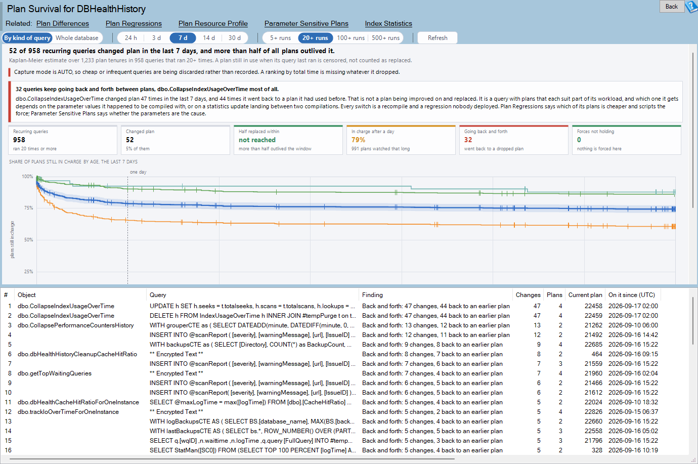
Plan Survival is one of the reports in Database Health Monitor. It runs against your own servers, and it takes about a minute to have this same screen open on one of them.
The shortcut that makes every database look unstable
So you decide to count plan changes. Sensible. The trouble starts when you try to turn those counts into a lifespan, because most plans on a healthy database have not ended yet.
A plan still running when its query last executed has only proven that it lasted at least as long as you watched it. Two shortcuts follow from that, and both mislead.
| Shortcut | What it does to your picture |
|---|---|
| Count only plans that were replaced | Replaced plans are the short lived ones by construction, so every database looks unstable. |
| Treat the end of the window as the end of every plan | The chart invents a replacement at the exact moment you looked. |
The first one is the more common. It produces an alarming average lifespan of a few hours, someone panics, and a week is spent chasing a problem that was an artifact of how the number was built.
What a survival curve measures instead
Medicine solved this problem decades ago. When patients are still alive at the end of a study, you do not drop them and you do not declare them dead. You count them as watched for exactly as long as they were watched, then let them leave the study quietly. That is the Kaplan-Meier estimate, and it fits plans well.
Here is how it works on a database. Each plan is followed from the moment it took over. When a plan is replaced while its query keeps running, the curve steps down. When a plan is simply still in use at the last observation, it leaves the count without moving the curve, and the chart draws a small tick instead of a step.
At each age where a replacement happened, the curve is multiplied by the share of watched plans that survived that age. One replacement is a hairline step when hundreds of plans are being watched. With three plans, the same replacement is a cliff. That is why the report prints the number still watched under the axis. A step you cannot size against its population is a step you cannot trust.
Counting a plan change honestly
The curve is only as good as the definition of a change. The report builds each plan lifespan, which it calls a tenure, as a run of the query's own active intervals in which one plan shape was used every time. A few rules keep that count from lying.
- Side by side is not a change. A cursor statement carries two plans that run together in every interval. Sort them by first execution and they appear to alternate, which on a real database reads as a plan change every hour. The report treats them as two tenures at once.
- Replaced means the query carried on without it. A plan still in use in the last interval the query ran is counted as alive, never as replaced.
- Cleanup is not a replacement. When Query Store removes a plan, through size based cleanup, stale query cleanup or
sp_query_store_remove_plan, and later captures the same shape under a newplan_id, tenures are built onquery_plan_hash, so it stays one tenure. - Ages start no earlier than the window. A plan already running when the window opens may have been in charge for months. Its age is counted from the later of its first compile and the window start, so every age on the axis is one the window really covered.
Every execution counts, aborted and failed ones included. The question is which plan ran, not whether the run went well.
If you want the longer story on what actually differs inside two plans once you know a query changed, we wrote about it in What Changed in the Query Plan Before It Got Slower. This report tells you which queries to take there.
Query Store plan instability on one page
The report lives under a database in the tree, at Real Time, then Query Store. It needs SQL Server 2016 or newer, Query Store turned on for that database, and VIEW DATABASE STATE to read the catalog views. It is hidden on master and tempdb, where Query Store cannot be enabled.
A verdict line at the top names the single most important finding, ranked in a fixed order. A forced plan that is not holding comes first. After that come queries going back and forth, then a database where half the plans are replaced within a day, then a real share replaced within a day, and finally plans staying put.
The forced plan sits at the top for a reason. Query Store may say plan 14 is forced while the query runs on plan 19, or the force may have failed outright. A force that does not hold is worse than no force at all, because everyone still believes it is the fix.
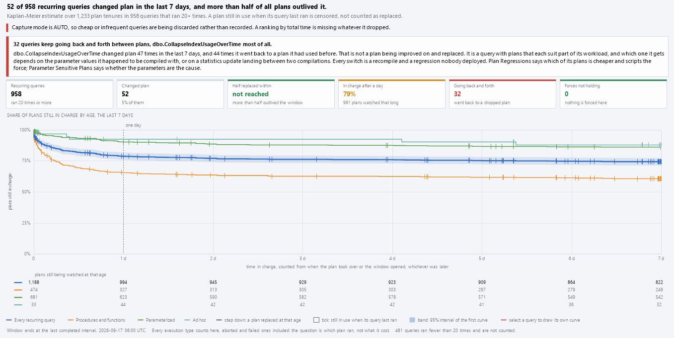
Six tiles carry the headline numbers. Recurring queries is the population. Changed plan counts those with at least one replacement. Half replaced within gives the age where the whole database curve crosses 50 percent, or says it was not reached. In charge after a day reads the curve at 24 hours. Going back and forth and Forces not holding each count the queries that matter most, and clicking either one filters the grid to just those.
Toolbar choices matter more than they look. A week is the default window because it is long enough for a nightly statistics update and a weekly job to both appear. The run floor, from 5 up to 500 executions, keeps out queries that ran twice, which cannot change plan in any way that means anything, and ad hoc text with a literal in it, which is a brand new query every time.
Reading the grid, worst finding first
Under the chart, the grid lists up to 50 queries, ordered by worst finding, then most changes, then most executions. Every recurring query is in the curve whether it is listed or not.

The Finding column sorts queries into plain categories: force not holding, back and forth, several changes each to a new plan, changed once and stayed, forced and holding, one plan all window, and plans in use together. Notes spells out which plans a query went back to, why a force failed, and how long a plan has been in charge since before the window.
Compare Longest run with Typical run. A query whose longest run is a week and whose typical run is forty minutes has a stable plan that gets interrupted. One where both are tiny has no stable plan at all. Those two stories need different fixes.
Double-click a row and you get the statement with its tenures beside it. Right-click offers the next step: explain every tenure in order, jump to Plan Differences or Plan Regressions, open Parameter Sensitive Plans for a query that goes back and forth, or go to Automatic Tuning for one with a forced plan. You can also copy a read only SELECT over sys.query_store_plan for that query, and nothing runs when you do.
Two puzzles the curve explains
Half the plans are replaced within hours, yet only a few queries changed plan. The curve counts tenures, not queries. A query that recompiles on every run and alternates between two plans makes a new tenure at each switch, and a handful of those can outnumber every stable plan on the database. The summary line says what share of replacements belong to queries going back and forth, which tells you whether a few offenders are skewing the picture.
The grid shows one plan, but sys.query_store_plan lists two plan ids. Plans are compared by query_plan_hash. The same shape under a second plan_id, whether it was captured again after removal or recorded for another reason, is not a change.
A related habit is worth building. If a query flips at a certain time of day, pair this report with Which Hour of the Day Is Slower Than It Used to Be? to see whether the hour and the plan change line up.
What to do with the answer
Start with the verdict. If it names a forced plan that is not holding, deal with that first. Read the failure reason Query Store recorded, then decide whether the force should be repaired or removed. Leaving a failed force in place keeps a false sense of safety alive.
If it names queries going back and forth, the usual suspect is a query whose plans each suit part of its workload. That is a parameter sensitivity conversation, and the Parameter Sensitive Plans report is the next door to knock on. Forcing one of the plans may help one customer and punish another.
If it reports plans staying put, believe it, and spend your hour elsewhere. That result is a real answer and worth having on file.
Finally, check the messages before trusting any chart. A banner saying Query Store history starts after the window begins means the window is only partly covered. Capture mode AUTO means cheap or infrequent queries were discarded and will not appear in the curve. Fewer queries than you expected may simply have fallen under the execution floor. Query Store Health is the report to open when the data itself is in doubt.
The full reference for every column and menu entry is in the Plan Survival documentation. We find that people who run it once on a quiet server learn more about their own workload than they expected, and the results are usually a short list rather than a long one.
What to check on your own server
- Open the report on a database with Query Store on and set the window to 7 days with the 20+ runs floor
- Read the verdict line first and check whether a forced plan is listed as not holding
- Click the Going back and forth tile and list those queries
- Select the top query and explain its plans to see which tenures alternate and when each started
- Check the Query Store Health banner if the history starts late or capture mode is AUTO
Try Database Health Monitor Today
Plan Survival shows how long plans last on a database and which queries keep changing them, flipping back, or losing a forced plan, so a query that was fast yesterday stops being a mystery. Database Health Monitor shows it on every instance you connect, in the time it takes to open the report.
Download Database Health Monitor and run the Plan Survival report against your own server. There is nothing to configure first, and you will know inside a few minutes whether it tells you something you did not already know.