
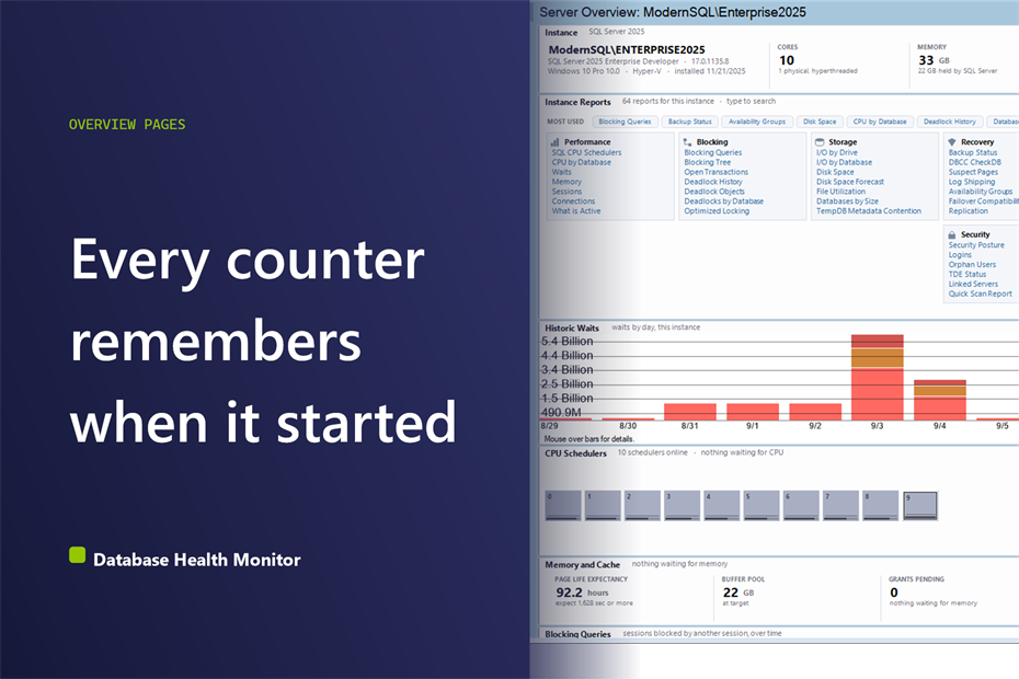
Query sys.dm_io_virtual_file_stats on a server that has been up for a month and you get a latency figure for every file. Almost nobody trusts it the first time, and across the client environments we work in, that suspicion is healthy. A SQL Server overview built on dynamic management views is only as honest as your idea of when each counter started counting. Database Health Monitor opens every instance on a page made of exactly those readings, and this post is about what sits underneath them: what they count, what they leave out, and what a hand written query usually gets wrong.
What do the numbers on a SQL Server overview page actually count? A SQL Server overview page reads dynamic management views such as sys.dm_io_virtual_file_stats, and much of what they hold is cumulative since the instance started. Drive latency is an average since restart, page life expectancy needs scaling to buffer pool size, and backup exposure skips system databases and SIMPLE recovery. Read each number with its reset point in mind.
In this post
- What a SQL Server overview is really reading
- Drive latency is an average with a very long memory
- Memory: the 300 that came from a small machine
- CPU: a queue is not the same as busy
- Backup exposure and what the query leaves out
- Weeks of waits above minutes of CPU
- What the corrected readings tell you
What a SQL Server overview is really reading
Every live panel on the Server Overview page is a read of a dynamic management view. That is why the page has exactly one permission message. A login without VIEW SERVER STATE gets a single notice, once, instead of twenty panels failing one after another. If your own query returns nothing or an error, check that permission before anything else.
The second thing to know is what the reads cost. The live panels draw on memory resident structures, with no locks and no I/O. They share one background reading, and the interval is a setting called ServerRefreshInterval, five seconds by default. Three things deliberately sit outside that loop. The instance band is read once, since cores, memory and install date are configuration. The report navigator is built once, because it is a directory and not a reading. And backup exposure is read once, when the page opens, because it is the only panel that touches a real table.
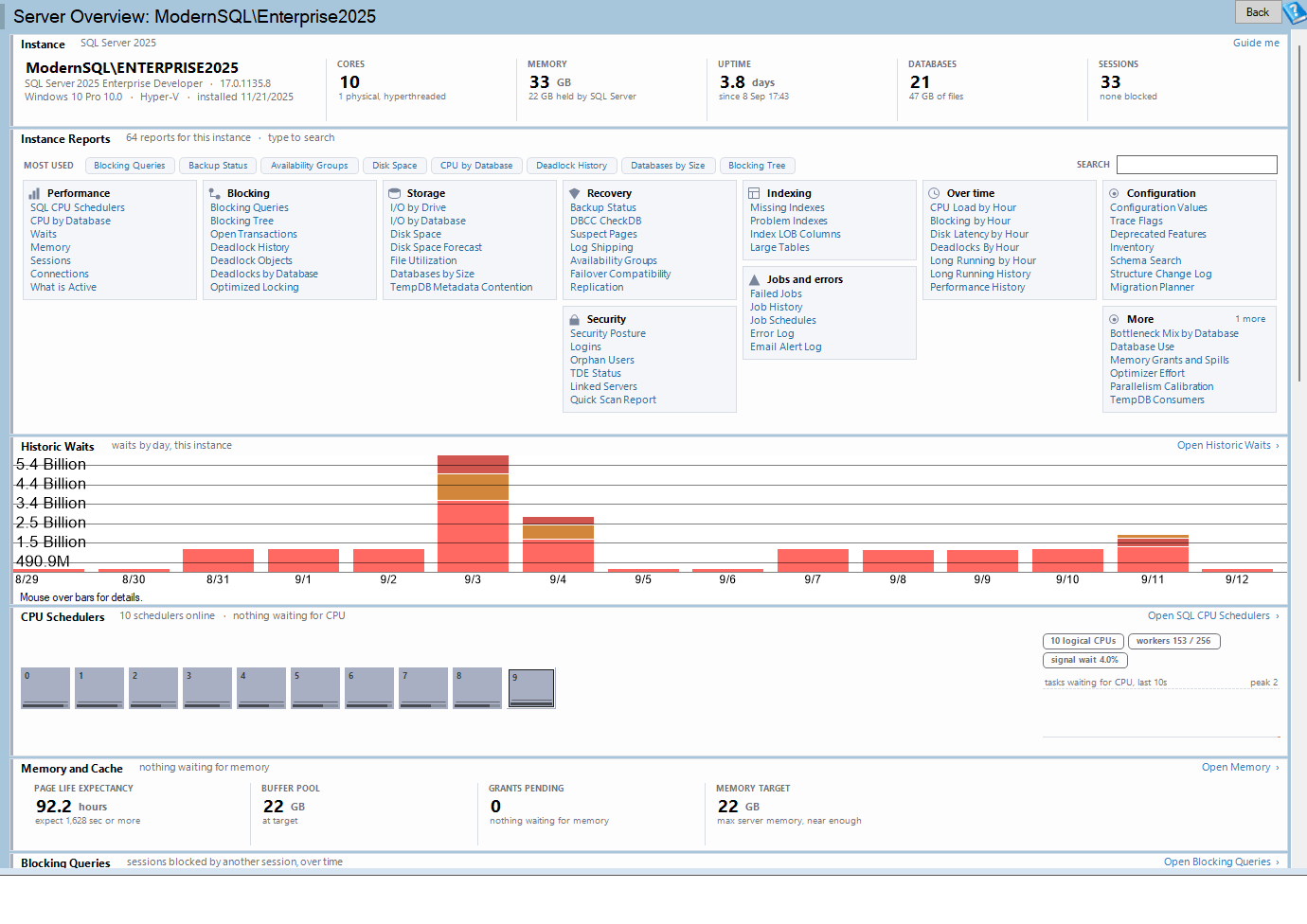
Server Overview is one of the reports in Database Health Monitor. It runs against your own servers, and it takes about a minute to have this same screen open on one of them.
That split matters when you compare the page to your own scripts. A number from a memory structure describes this instant or this uptime. A number from a table describes a stretch of days. Mixing the two in one query, with one mental timescale, is where most bad conclusions start.
Drive latency is an average with a very long memory
The storage panel reads sys.dm_io_virtual_file_stats and groups files by the drive where they actually live. It reports average stall per read and per write, one cell per drive. The thresholds are plain. Under 10 ms is quiet. Between 10 and 20 ms goes amber and deserves a look. Over 20 ms goes red.
| Average stall | Cell color | What to do |
|---|---|---|
| Under 10 ms | Quiet | Nothing |
| 10 to 20 ms | Amber | Worth a look |
| Over 20 ms | Red | Open the full I/O report |
Here is the trap. Those figures are cumulative since the instance last started. A restore, a long index rebuild, or one bad afternoon three weeks ago is still folded into the average and will keep dragging it up. Worse, the reverse also holds. A drive that went bad ten minutes ago has barely moved the number, so a green cell does not prove the storage is fine right now.
When we see somebody panic over a red cell on a server that feels fine, this is nearly always the reason. The sensible response is not to dismiss the cell. It is to open I/O by Drive or Disk Latency by Hour by Day and look at the recent picture, where the old rebuild no longer dominates.
There is a second distinction that hand written queries blur. The page shows I/O volume by database elsewhere, and that tells you who is doing the reading. Latency tells you whether the storage is keeping up. They are different questions. The database doing the most I/O is quite often the one on the fastest disk, so ranking databases by volume tells you nothing about which drive is struggling.
Memory: the 300 that came from a small machine
The memory panel shows four numbers. Page life expectancy is how long a page survives in the buffer pool. The buffer pool figure is what SQL Server holds and whether it is still growing. Memory target is how much it would like to hold. And grants pending counts queries that asked for memory and have not been given it.
Page life expectancy is the one people query by hand, and the one they judge against 300 seconds. That number dates from a machine with 4 GB of buffer pool. Apply it to a server holding 200 GB and five minutes of page life means the whole pool is being replaced every five minutes, which is a very different statement. So the panel scales its threshold to the buffer pool actually in use and prints the figure it expects for this instance underneath the reading. The same raw value can be fine on one server and alarming on another.
Grants pending is simpler, and in our experience more useful. Anything above zero is the clearest single sign that an instance is short of memory, so the panel turns red on that reading alone. There is no scale to adjust and no history to consult. Either queries are waiting for memory or they are not.
CPU: a queue is not the same as busy
The CPU strip draws one tile per scheduler, grouped by NUMA node, and the color means one thing only: how many tasks are queued behind that scheduler. A slate tile has nothing waiting. Amber is one task, deep amber is two, and red is three or more. A dashed outline marks a CPU the instance is not using at all.
Keeping color to the queue is a deliberate choice. How hard a scheduler is working is a separate thing, drawn as a bar along the bottom of the tile and scaled against the busiest scheduler on the instance. The small line inside each tile is that scheduler's own recent queue history. So a calm wall of slate means a calm server, and a busy scheduler with nothing queued does not raise a false alarm.
Two numbers on the right rail cannot be read from any single tile. Worker threads used is measured against max_workers_count, and it is the early warning for THREADPOOL starvation. That is the failure that takes an instance down and locks you out of it at the same time, so you want to see it coming. The reading turns red past three quarters. Signal wait ratio is the textbook CPU pressure measure, and it turns amber at 20 percent.
Beneath both sits ten minutes of tasks waiting for CPU across the whole instance. Read the shape. A plateau is the finding. A single spike almost never is, because a spike of one query tells you about one query. If a tile looks hot, double-click it and the SQL CPU Schedulers report opens with that scheduler already selected.
Backup exposure and what the query leaves out
Everything else so far describes seconds. Backup exposure describes hours and days, and it is where a careless query does the most damage, because the obvious query produces a finding that is wrong on every server ever installed.
| Cell | What it measures | What it deliberately skips |
|---|---|---|
| Worst log gap | Longest any database has gone without a log backup | SIMPLE recovery databases and system databases |
| No recent full | Databases with no full backup in the last seven days | Nothing noted in the documentation |
| Oldest DBCC CheckDB | Longest any database has gone unverified | Nothing, but needs SQL Server 2016 SP2 or newer |
Take the log gap. A database in SIMPLE recovery has no log chain, so it can never have a gap. System databases are left out as well, because model ships in FULL recovery and nothing ever backs up its log. Count it and the same finding lands at the top of this panel on every instance, which teaches people to ignore the panel. We have watched that happen with homemade checks more than once.
One case overrides everything else. A user database in a logged recovery model that has never had a log backup reads as never rather than as a number, and it takes the cell whatever else is on the instance. Its log will grow until the disk fills. That is not a number to rank. It is a dated problem.
The DBCC age is read from DATABASEPROPERTYEX, which requires SQL Server 2016 SP2 or newer. On older builds the cell reads unknown, and the Last DBCC CheckDB Known Good report does the more expensive version of the same check. If your own script returns nothing for that property, the build is the first suspect.
Weeks of waits above minutes of CPU
The page also carries one reading that is not a live DMV at all. Historic waits shows waits by day, drawn from the historic monitoring database. It sits above the live CPU strip on purpose: the shape of the last month is the context for the shape of the last ten minutes. A live wait total tells you what has piled up since startup. A daily chart tells you whether today looks like every other Tuesday.
Because it depends on stored history, the panel can be empty for three different reasons, and it says which. Historic reporting may not be configured for the installation. The instance may not be in the monitored set. Or monitoring may have started without gathering enough yet, in which case a Test Connection button appears and the panel names the monitoring database it is reading from. None of those means anything is broken on the server.
The instance band at the top is worth a glance for a similar reason. A restart inside the last hour turns the uptime figure amber, because every cache is cold and every plan is new, and that explains a great deal of odd behavior without any further digging. An out of support release raises a chip and a stripe a year ahead of the end of security updates, not after.
What the corrected readings tell you
Put the pieces together and the pattern is consistent. Each number answers a question on its own timescale, and the mistakes come from asking the wrong timescale of the wrong number. Latency is a long average. Grants pending is a right-now count. Backup exposure is days. The CPU queue is minutes. A sound reading of an instance asks which of those you need before it looks at the figure.
The page is also yours to arrange. Right-click any panel to move it up or down, hide it, or reset the lot. A hidden panel leaves a one line placeholder so you can bring it back without disturbing the rest, and the arrangement is kept per installation across upgrades. If you want the full reference for every panel and message, the Server Overview documentation covers it.
What we would suggest is the cheap experiment. Pick one server you think you understand and compare these five readings with what you believed about it. The business cost of a wrong belief is rarely the hour spent checking. It is the outage you scheduled around the wrong cause, or the backup gap you discovered during a restore.
What to check on your own server
- Check whether grants pending reads above zero, because any value above zero means queries are waiting for memory right now
- Compare page life expectancy with the figure scaled to your buffer pool, not the old 300 seconds
- Read the drive latency cells, then open I/O by Drive for any drive showing amber or red
- Compare worker threads used with max_workers_count, and note the signal wait ratio if it reaches 20 percent
- Look for any user database showing never as its log backup gap
Try Database Health Monitor Today
The Server Overview report reads the DMVs for you and corrects the traps in them, so you see latency, memory, CPU queueing and backup gaps without rebuilding the queries. Database Health Monitor shows it on every instance you connect, in the time it takes to open the report.
Download Database Health Monitor and run the Server Overview report against your own server. There is nothing to configure first, and you will know inside a few minutes whether it tells you something you did not already know.