A batch job that finishes in ninety seconds on a Tuesday and takes eleven minutes on a Thursday, with nobody having touched a line of code in between, is a pattern we see across client environments in a lot of different industries. Ask whoever is on call and the answer is usually a shrug and something like it seems to happen more on certain days, which really means nobody has looked closely enough to say when. The server is not simply slow. It is getting blocked, in short bursts, at hours nobody wrote down, and every conversation about fixing it starts from a guess, because nobody kept the SQL Server blocking history that would turn the guess into a fact.
The first move most teams make is to count: how many sessions were blocked this week, pulled from whatever monitoring is already running or from a quick script against the wait statistics views. The number goes up, everyone nods that blocking is a real problem, and the investigation usually stalls right there, because a weekly total cannot say whether the trouble was one long storm during a Sunday maintenance window or forty small collisions spread evenly across five ordinary business days. Those are two different problems calling for two different fixes, and a single running total flattens them into one. Averaging by day does not help much either. A rough hour buried inside an otherwise ordinary Tuesday gets diluted into a daily figure that looks unremarkable, and the team moves on believing the problem already passed.
What actually settles the question is not a total, it is a grid: which hour, on which day, carried the blocking, kept separate instead of added together. That is the honest number, because it does not throw away the one detail that matters, timing, in favor of the one that does not, a cumulative count. A cluster of dark hours every weekday morning at nine is a different finding from the same total scattered at random across a month, and only a report that keeps hour and day apart can tell you which one you are actually looking at.
Turning a SQL Server blocking history into a picture
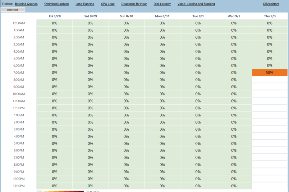
The Blocking by Hour by Day report in Database Health Monitor is that grid, drawn as a heat map. Hours run down the left side, days run across the top, and each cell covers one hour. The darker the cell, the more blocking landed in it during that hour, and the shading is built to read correctly by lightness alone, so it still makes sense in grayscale, on a projector, or for a reader with any form of color vision deficiency. Nothing about reading it depends on memorizing what a particular shade means.
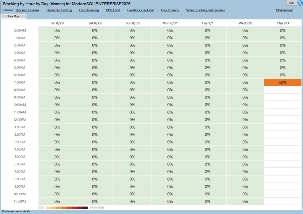
Blocking by Hour by Day (historic) is one of the reports in Database Health Monitor. It runs against your own servers, and it takes about a minute to have this same screen open on one of them.
No data is not zero
One detail matters more here than on almost any other report: a cell where nothing was ever recorded looks nothing like a cell that recorded a peaceful, blocking-free hour, and the two are drawn differently on purpose. On most reports that distinction is a footnote. On a blocking report it is the whole point, because an hour nobody was watching looks exactly as calm as an hour that genuinely was calm, and mistaking one for the other is how a monitoring gap gets reported upward as good news. A blank row running the full width of the grid almost always means the collection service was not running that hour, not that the server had an unusually quiet stretch.
What a dark cell actually contains
Clicking a dark cell opens the blocking captured in that specific hour, and it opens as incidents rather than as a raw list of rows. That distinction used to be lost entirely: a statement that blocked eleven separate times in an hour and one that blocked exactly once could come out of an older view looking identical, both reduced to a single row per query text. The rebuilt hour view keeps that apart, because the single most useful fact about a bad hour is whether it was one long jam or a string of short ones, and that is exactly what gets erased the moment every capture collapses down to its statement text alone.
Two ways of looking at the same hour sit side by side. The default view lays out one lane per database across the hour, with back-to-back captures against the same database merging into a single band, so sixteen minutes of continuous blocking draws as one sixteen-minute bar instead of thirty-odd near-identical rows stacked on top of each other. Bar height is how many sessions were stuck at once; how the bar is filled shows how long the worst of them sat waiting. A second view regroups the same captures by the query sitting at the head of each chain, ranked by how much blocked time it caused, split out by database.
- The default lane view answers when the trouble happened and how long it ran
- The query-ranked view answers what to fix, and is the one worth pasting into a ticket
- Color in both views tracks only how long a session waited, never who it was, so nothing needs a legend to make sense
Lining it up with the rest of the picture
The time range on this page, one to six weeks in one-week steps, is shared with every other hour-by-day heat map in the product: CPU, long-running queries, TempDB, deadlocks, disk latency, all of it. That shared range is what makes it possible to lay two of these grids side by side and actually compare them, and for blocking that comparison is usually the point. Contention that lines up with a CPU peak points at load; contention that shows up while CPU sits flat points at a session holding locks and doing nothing at all, which is a completely different conversation with whoever wrote the code.
| What you see | What it usually means |
|---|---|
| A dense band right at the start of the business day | The whole office arriving at once against a cold cache; often clears itself, sometimes worth an index review |
| Dark cells lining up with the overnight maintenance job | Rebuilds or integrity checks now running long enough to spill into live traffic |
| One dark column repeating roughly once a month | Month-end processing, predictable enough to schedule around |
| Dark blocking cells next to a flat CPU by Hour by Day chart | A session sitting on locks while doing nothing at all, the classic idle-transaction case |
| Blocking landing at the same few minutes past the hour, over and over | A scheduled job, worth checking against the Agent job schedule first |
| A whole row blank across every single day | The collection service was not running that hour, not a genuinely quiet one |
What it needs before it will draw anything
This is a historic report, reading from a table called ‘blockingOverTime’ inside the ‘DBHealthHistory’ repository, populated by the collection service running against the instance. No collection configured means no picture, which is worth checking first if a newly added server shows nothing at all. One advantage worth knowing about: because it reads history rather than talking to the live instance, it still works when the monitored server itself is down or unreachable, which is exactly the moment somebody usually wants to know when today’s trouble actually started.
The single most useful fact about a bad hour is whether it was one long storm or a dozen short ones, and a row-per-query view destroys that fact before it ever reaches the screen.
None of this requires guessing anymore. A cluster of dark cells becomes a click, the click becomes an hour full of incidents rather than rows, and the worst offender in that hour becomes a line item somebody can actually act on. Teams that used to spend a morning reconstructing when a blocking problem started now spend a few minutes confirming it, and the rest of the morning fixing whatever the offenders view pointed at instead of the report itself. If you would rather have someone walk through what your own blocking history is actually showing, that is exactly the kind of thing a second pair of eyes is good for.
Try Database Health Monitor Today
It replaces a guess about when blocking happens with an hour-by-hour record you can point at and read the actual incident behind it. Database Health Monitor shows it on every instance you connect, in the time it takes to open the report.
Download Database Health Monitor and run the Blocking by Hour by Day (historic) report against your own server. There is nothing to configure first, and you will know inside a few minutes whether it tells you something you did not already know.