
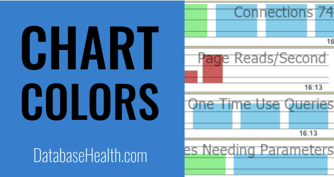
Understand SQL Server performance with Database Health Monitor’s color-coded charts. Learn red, green, and blue meanings for efficient database health.alth Monitor tool transforms complex data into accessible insights through its intuitive use of color-coded charts. These visual cues allow database administrators to quickly identify issues, track improvements, and maintain optimal performance with minimal effort.
Each color in the Database Health Monitor charts carries a specific meaning, designed to streamline the monitoring process. Whether you’re dealing with a critical alert or confirming system stability, the color scheme provides an at-a-glance summary of your SQL Server’s status. This approach eliminates the need to dive deep into raw data, saving valuable time and reducing the risk of overlooking key metrics.
In this post, we’ll break down the significance of each color used in the charts, including a recent addition to the palette. By understanding what red, green, and blue represent, you’ll be better equipped to prioritize tasks, address potential problems, and ensure your database environment remains robust and efficient.
The Meaning Behind the Colors in Database Health Monitor Tool Charts
One of the key aspects of effective database monitoring is quick, visual insight into what’s happening with your SQL Server. The Database Health Monitor tool has always aimed to make database management easier and more intuitive, and a big part of that is in how information is displayed. A central feature of the tool is the color-coding used in its charts and reports, which help DBAs instantly spot problems or trends that need attention.
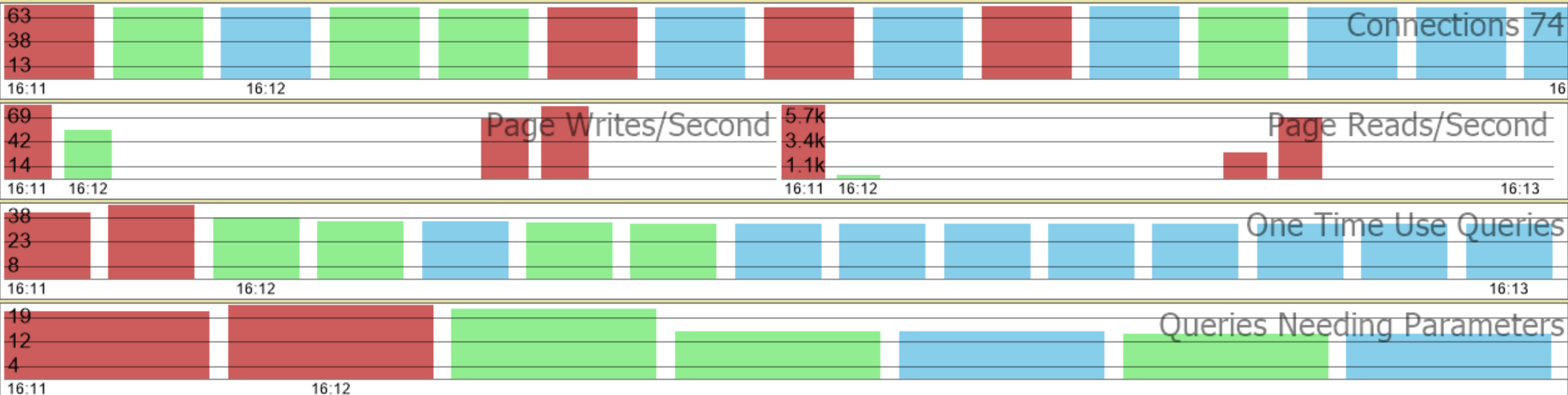
Recently, we added a new color to the mix—blue—which signifies “unchanged.” Let’s explore what each color in the charts represents and how you can use them to assess the state of your SQL Server environment at a glance.
The Color Scheme: Red, Green, and Blue
1. Red: Bad or Worse
Red is an industry-standard color for danger, and in Database Health Monitor, it’s no different. Whenever you see red on a chart or report, it’s a clear indication that something is wrong or has gotten worse since the last time you checked.
For example:
- A performance metric that has declined.
- An error count that has increased.
- A worsening blocking issue.
Red signals immediate attention, making it easy to focus on high-priority areas that could be affecting database performance or stability. Whether it’s high CPU usage, long-running queries, or a sudden spike in deadlocks, red tells you to take action now.
2. Green: Good or Better
Green is a reassuring color in the Database Health Monitor interface. It represents improvements or healthy statuses. When you see green:
- A previously troubling metric has improved.
- Performance bottlenecks have been resolved.
- Resource utilization has returned to normal levels.
Green is the color of peace of mind—it tells you things are either running smoothly or are headed in the right direction. It gives you confidence that your SQL Server environment is optimized and stable.
3. Blue: Unchanged
We recently introduced blue to the color scheme to provide better clarity in situations where a metric or condition has remained stable over time. Sometimes, metrics staying the same is actually a good thing—if, for example, your query performance is steady, you want to know that nothing has regressed but also hasn’t significantly improved.
Blue offers an at-a-glance confirmation that certain metrics have held steady, making it easier to focus on areas where changes have occurred. When paired with red and green, blue gives a complete picture, showing you where things have gotten better, worse, or stayed the same.
Why These Colors Matter
SQL Server Performance can shift rapidly, and as a DBA, it’s important to have the ability to assess large amounts of data quickly. The color-coding system in Database Health Monitor charts simplifies that process. Here’s why it’s effective:
- Speed: Instead of parsing through countless metrics and logs, a quick glance at a chart can tell you where to focus. If you see red, you know there’s an issue. If you see green, you can move on. If you see blue, you know things are stable.
- Trend Analysis: The colors help identify trends over time. If you see red turning into green, you know things are improving. If you see more blue over time, you know you’ve reached a stable state, and if that red keeps popping up, it’s time for deeper investigation.
- Improved Efficiency: DBAs often manage multiple servers and complex environments. Having a visual indicator like red, green, or blue helps prioritize work, making it easier to tackle the most pressing issues first.
Real-World Example: Color-Coding in Action
Consider a real-world scenario where you’re managing a busy SQL Server instance. You open Database Health Monitor Tool to check the Blocking Reports. Previously, you had identified that blocking was a problem and the charts showed red, indicating things were getting worse. After tuning your queries and adjusting indexing, you revisit the report the next day and see green—performance has improved.
On the same screen, you also notice some blue sections in other reports. These represent metrics that haven’t changed since your last check, signaling that while you’ve made improvements in one area, the rest of the system is stable.
This combination of red, green, and blue makes it clear where your attention is needed and where things are holding steady, providing a complete picture of your system’s health.
The introduction of blue to the Database Health Monitor color scheme has added another layer of clarity to an already powerful tool. Now, with the red, green, and blue system in place, DBAs can not only see what’s wrong and what’s improving but also where things are steady and don’t need immediate attention.
If you’re not already using Database Health Monitor, give it a try. With continuous surveillance, effective alerting, and a simple color-coded interface, it’s the best tool for keeping your SQL Server environment healthy and performant.
Download Database Health Monitor today at DatabaseHealth.com.
Summary for Color Meanings in Database Health Monitor
- Color-coded charts in Database Health Monitor for SQL Server performance.
- Red color indication of problems or worsening metrics.
- Green color representation of improvements or healthy statuses.
- Blue color addition for unchanged or stable metrics.
- Visual cues for quick identification of database health issues.
- Enhanced efficiency through prioritization of critical areas.